
Denver Art Museum exhibit brochure:
“The Dutch Still Life and It’s Modern Message”
This was not the first time I’ve created a problem for myself.
And it won’t be the last.
But it is my favorite problem that I’ve ever created.
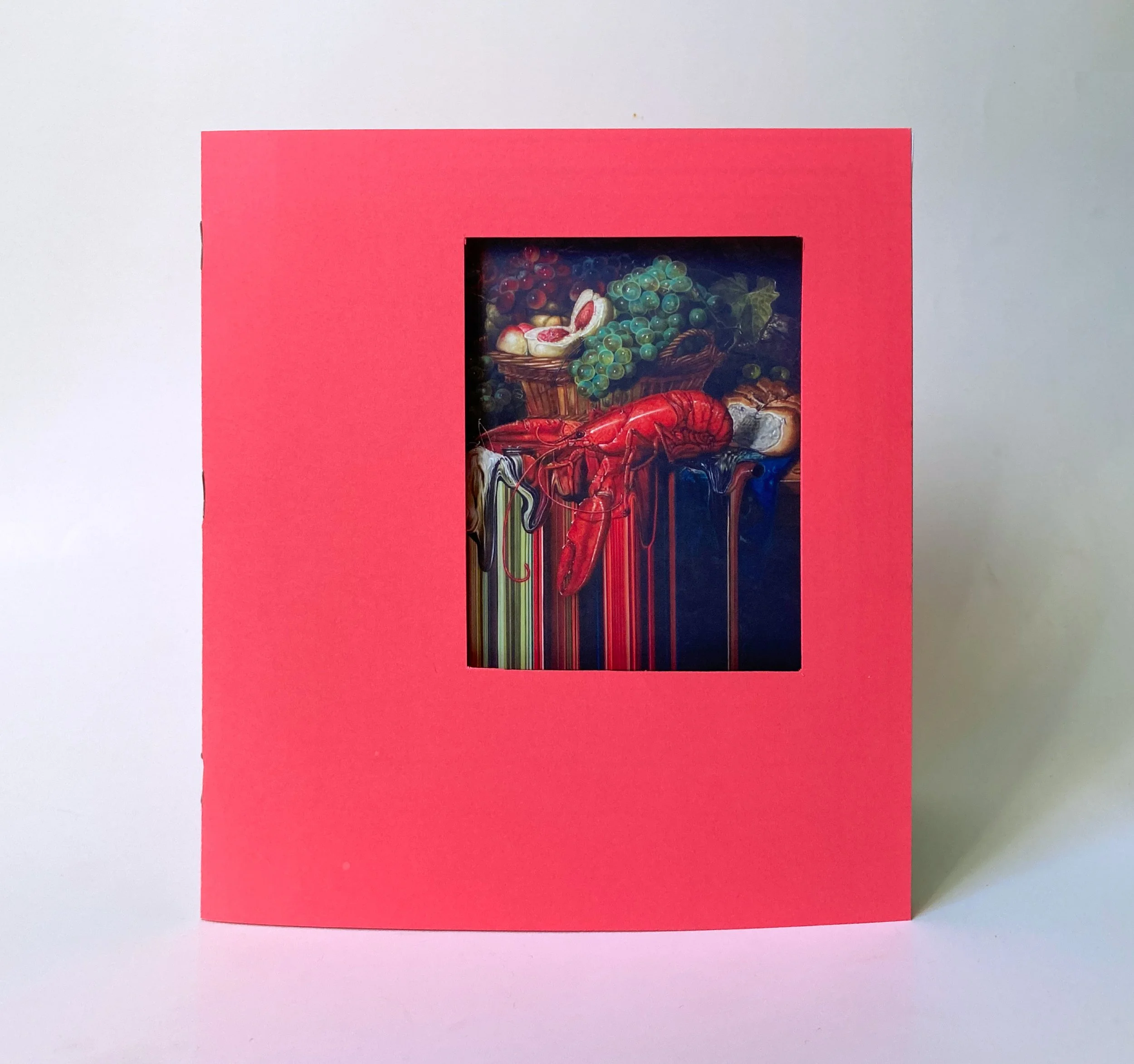
Let me explain: the concept behind this exhibit that I dreamt up is comparing modern day still life pieces to their ancestors: classic Dutch Still life paintings. That concept combined with my desire to not create a standard museum guide led me to designing a brochure with a die-cut window on each page, linking themes throughout the pieces. Ultimately this required a lot of planning; each window needed to open to a specific area of each painting. Every cutout is a unique dimension and located in a different area on each page, so I always had to be thinking several steps ahead. It took numerous paper dummies and test prints, but I’m so proud of the end result and I would love to mail a copy to the Denver Art Museum someday.
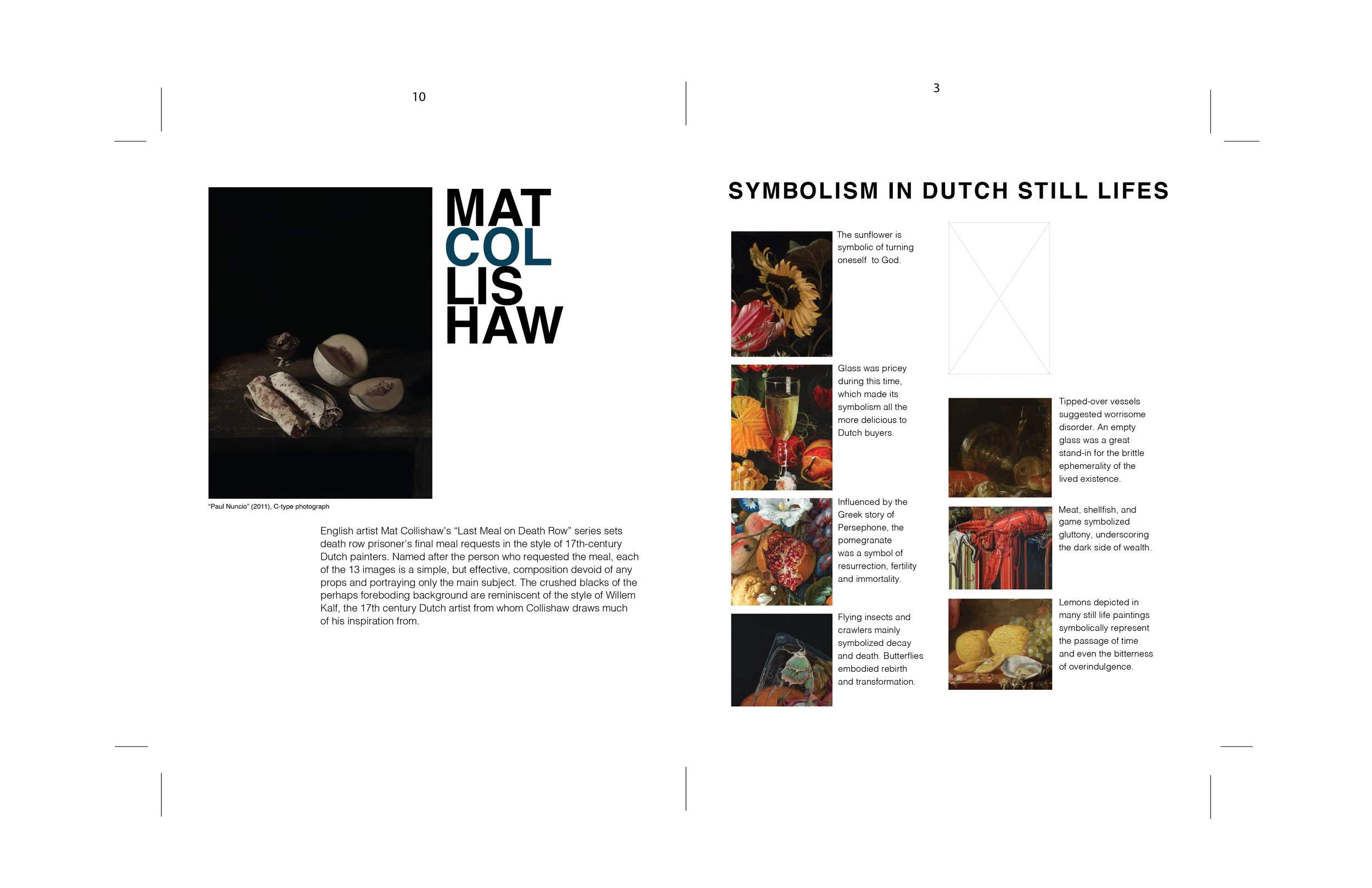

The light, dotted box on each page notates the window cutout.
Font: Helvetica
Paper:
Neenah Astrobrights in Rocket Red
Mohawk Practical Collection - Everyday Digital Smooth Uncoated White 80T
*Winner of 2023 American Advertising Awards Student Gold Addy in Special Event Materials
Project Scope:
Art Curation
Copywriting
Paper Engineering