Milk Duds Rebrand
Time for a refresh.
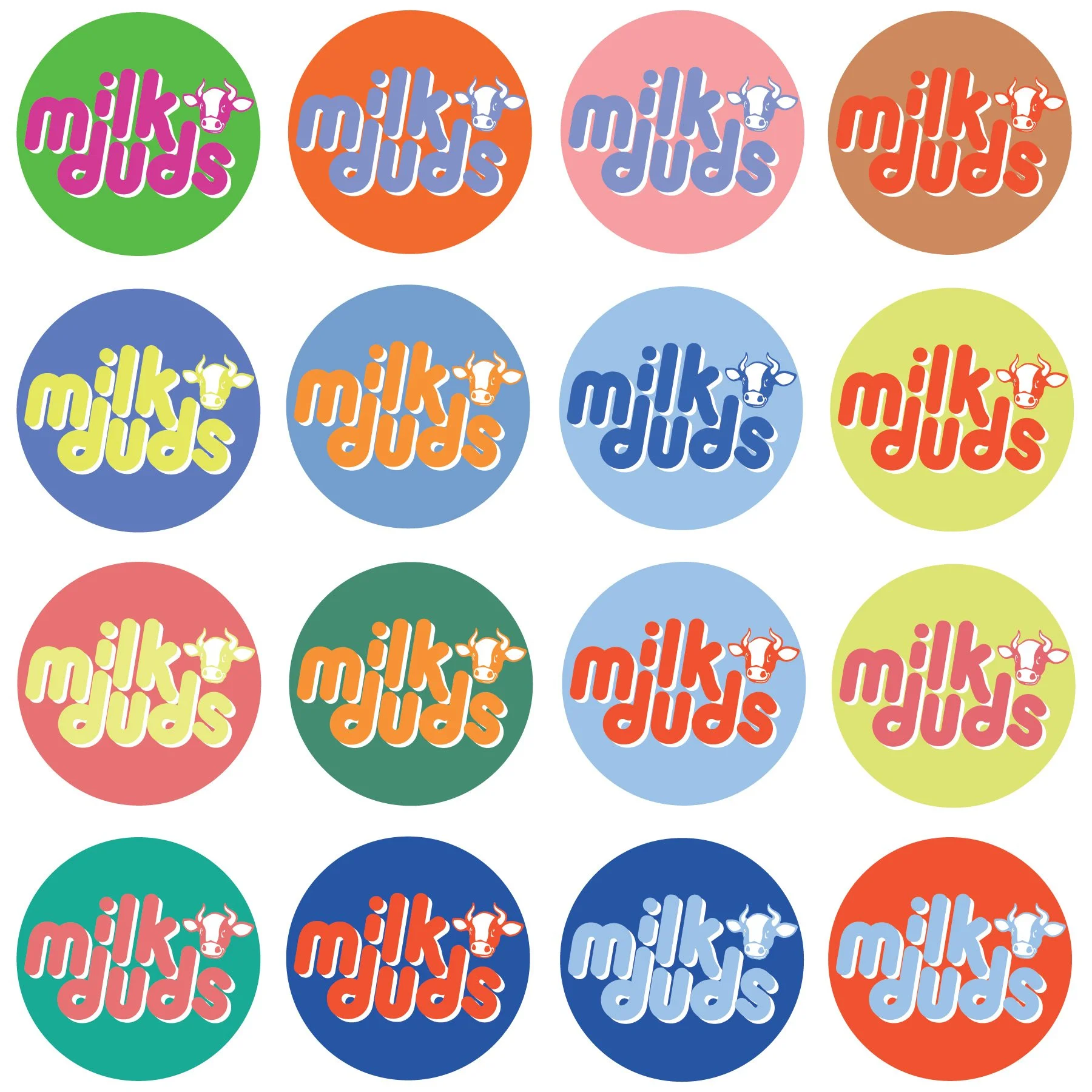
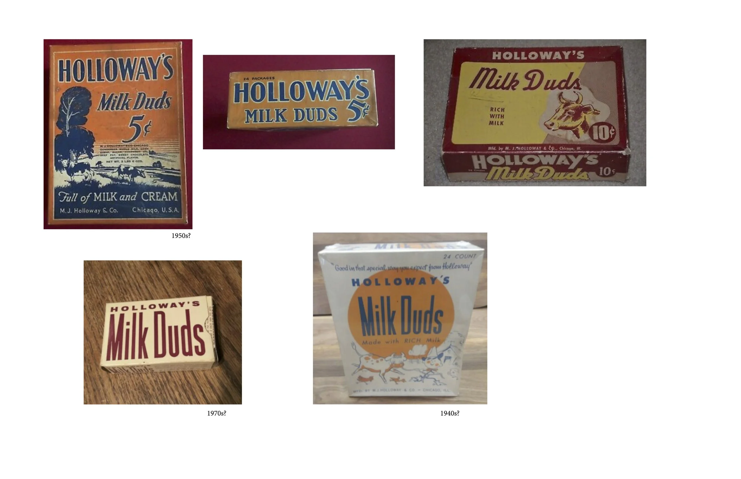
Milk Duds’ current packaging is…fine. I discovered in my research that it certainly has had more interesting iterations (though I was surprised to discover that it’s been a combo of brown and yellow for a LONG time.) I swapped out the typeface for a more fun one, updated the color scheme to reference some of their older packaging, and added a cow to put the “milk” back in Milk Duds.
Would it work in the real world? Absolutely not; it discards nearly a century of Milk Duds branding and would be completely unrecognizable at a glance. Maybe someday I’ll try doing a realistic rebrand. My classmates Brittany and Michellée did some really nice candy rebrands that I think are worth checking out.

some of my research document


Font:
Custom, handwritten type
Omnes Cyrillic Black
Colors:
Pantone 285U
Pantone 021U
Project Scope:
Branding
Art Direction
some color combos that didn’t make the cut