
3 Book-Series Cover Design
The Crystal Singer series is one of my favorite science fiction series. The books were written in the 80s so the predictions for future technology are wonderfully silly.
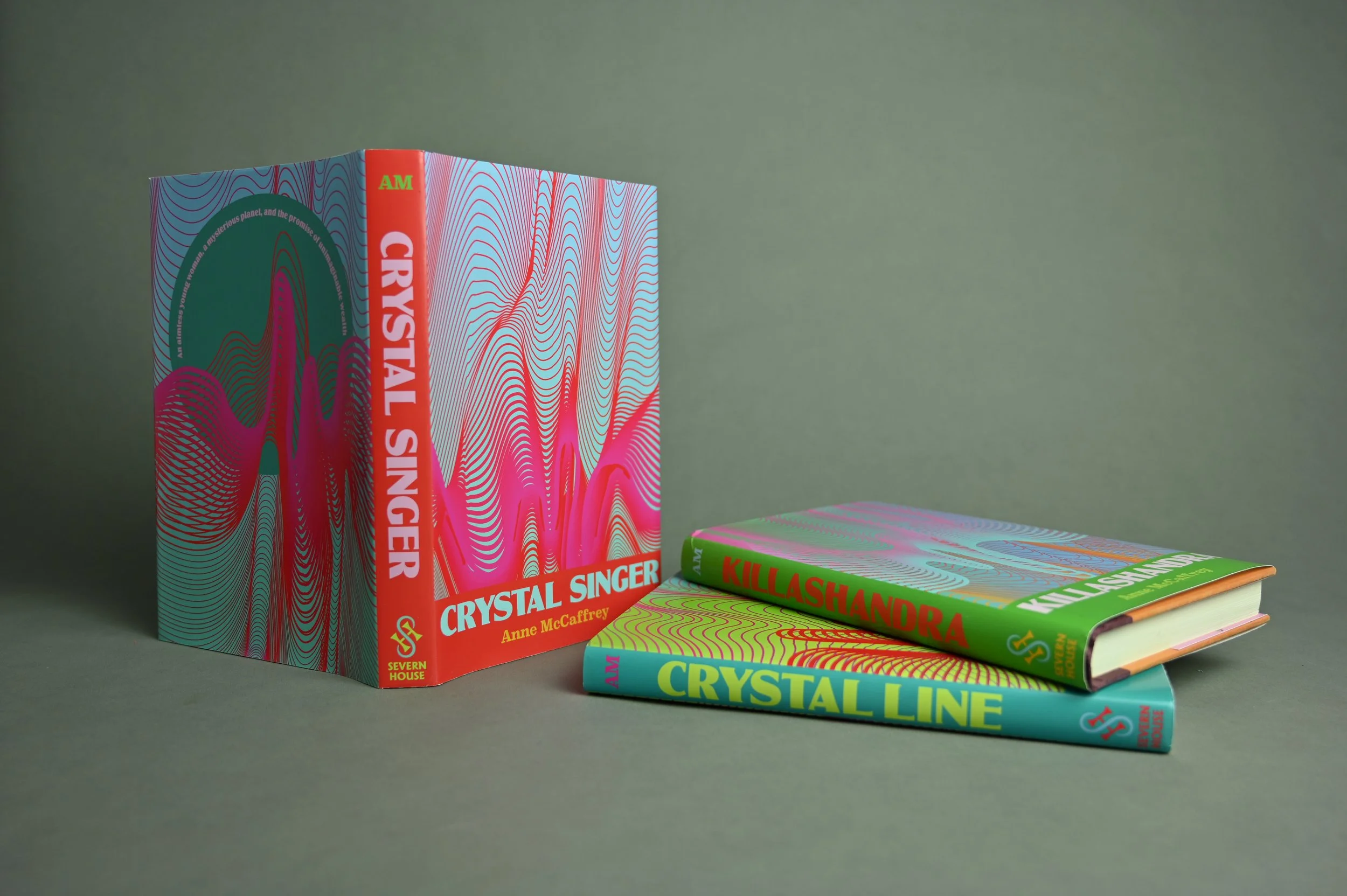
My design direction was pretty simple: the titular “crystal singing” comes from the characters mining rare and expensive crystals using sound waves. I took the shape of sound waves, paired it with vibrating color schemes (which is another reference to sound waves vibrating), and then used a soft chunky typeface for an 80s feel.


Font:
Globe Gothic
Arial
Superclarendon
Colors:
CMYK 5 94 100 0
CMYK 4 43 0 0
CMYK 66 8 98 0
CMYK 22 0 67 0
CMYK 52 0 24 0
though really there’s 15 or so colors between all these covers…
*Winner of 2023 American Advertising Awards Student Silver Addy in Publication Cover Design
Project Scope:
Packaging
Light Copwriting/Editing