
Nashville is about as far from Palm Springs as you can get.
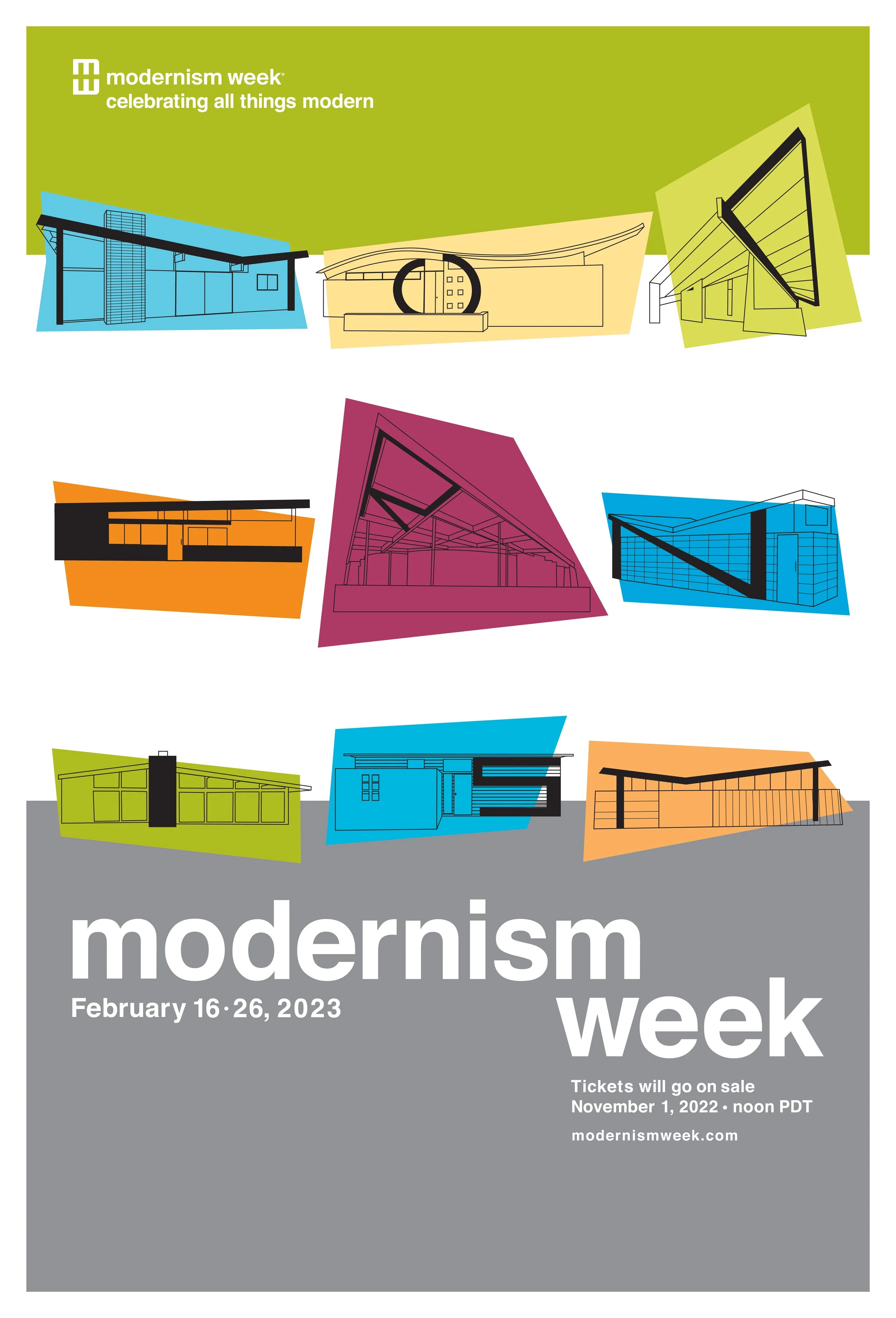
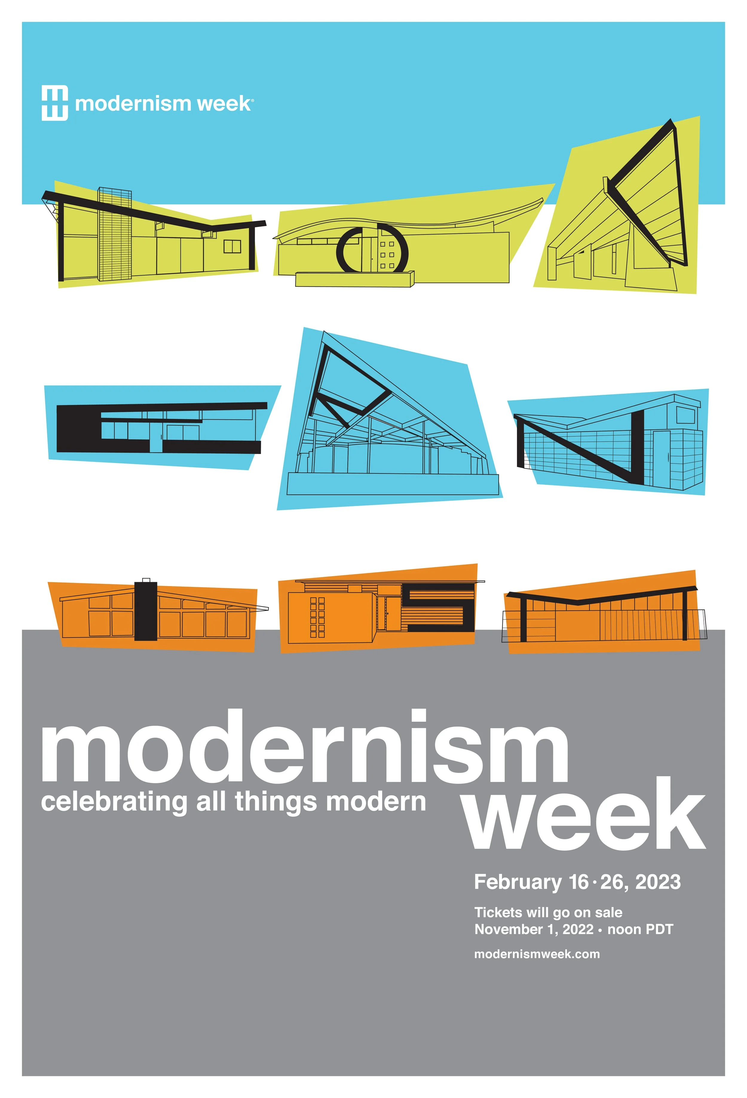
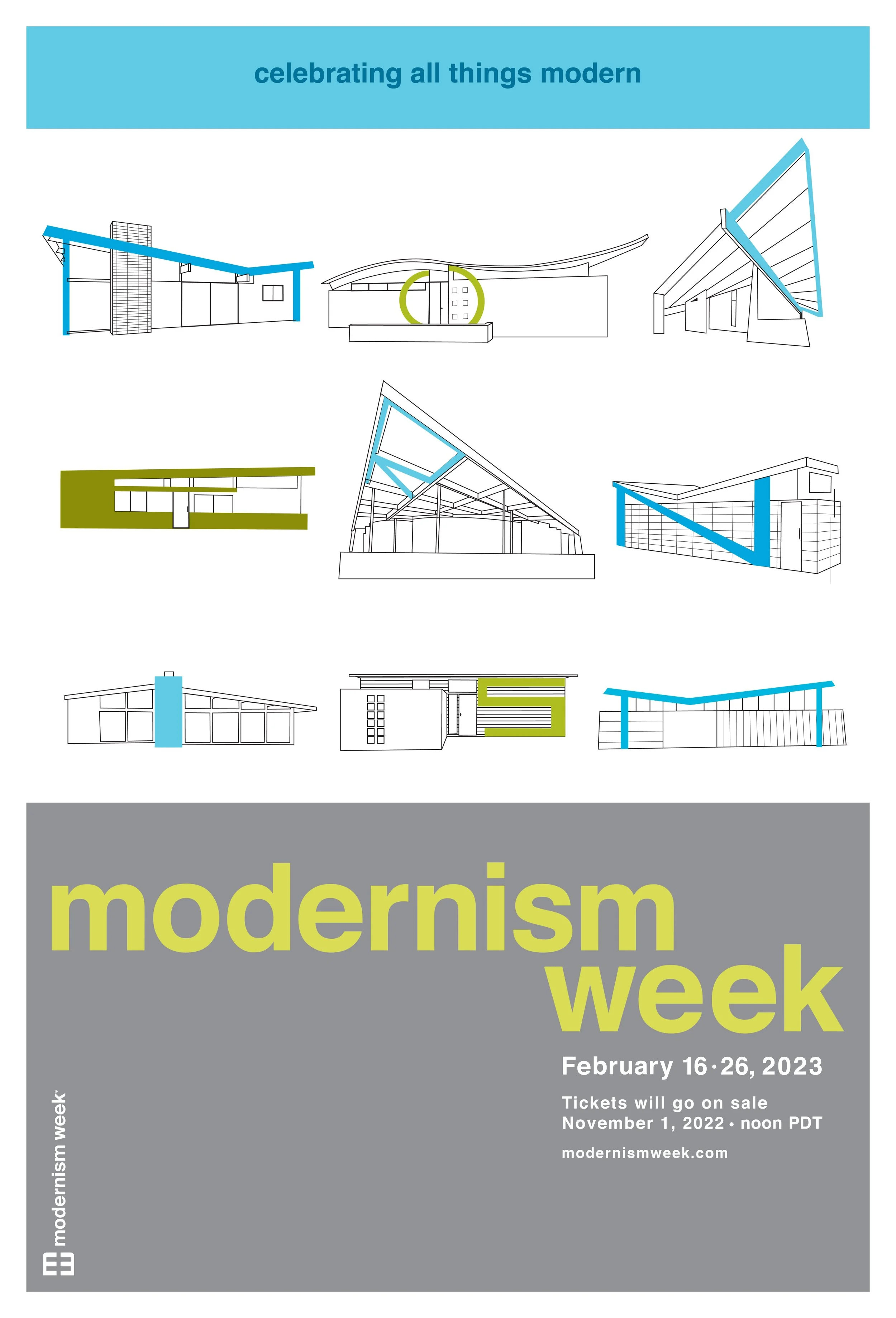
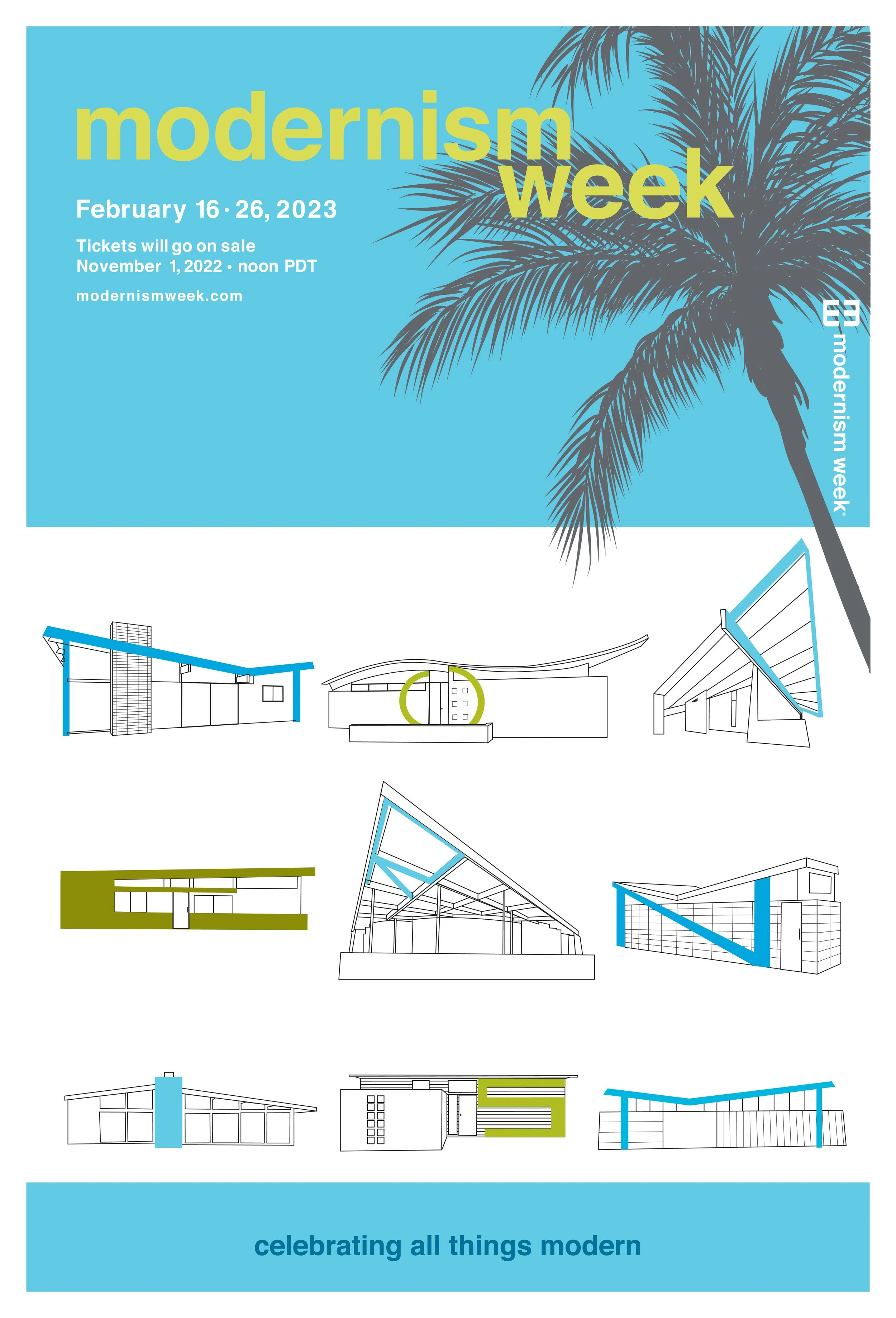
But a lucky connection between a Modernism Week board member and my design instructor presented the unique opportunity to create posters for the Spring 2023 event. Our task was to marry the architecture with typography. And this was also our class’ first time working with a brand’s guidelines: use their colors, don’t display the logo incorrectly, and for the love of type, use a complimentary typeface — that part was easy; their logo is set in Helvetica. The rest of it? A lot of struggle and a good learning opportunity. I know where I’d rather be in February…
Font: Helvetica
Colors:
CMYK 0 1 0 51
CMYK 55 0 9 0
CMYK 12 0 79 6
Pantone 717
Project Scope:
Illustration